How to Create Data Views of the Plotted Dynamics 365 Records
Plotting your Dynamics CRM data to derive data-driven results is easy these days with Dynamics 365 map integration. But sometimes it can be too much to understand or take into account. This can easily mean inaccuracies in your conclusive results or the action-plans. So, in this blog, we’ll demonstrate how to create data views of the plotted records.
For the demonstration purposes, we’ve taken Quick Maps, a Dynamics CRM map integration, in this blog. You can search for such a tool on MS AppSource.
If you have plotted multiple entities on the map, it’s not easy to recognize which record belongs to which entity. Sometimes you want all the records for a particular analysis but what if you want to check only some records of one specific entity?
In Quick Maps, there are some facilities provided using which you can enable/disable plotted records of the entities and show/hide the labels of any records of the entity on the map.
Let’s see how you can do so.
Step 1: Open “Map” page
If you are using Unified view:
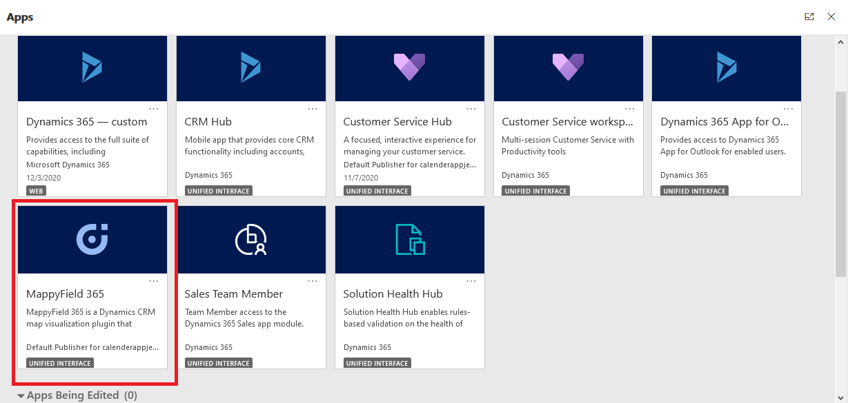
You can find the Quick Maps App on the Dynamics 365 screen. Click on it to navigate to Quick Maps.
OR
If you are using Classic View (old UI):
Find the “AppJetty” tab from the header menu and click on Map under the Quick Maps heading.

Step 2: Plotting entity data on the map
Select the Entity and its view for which you want to plot the data on the map.
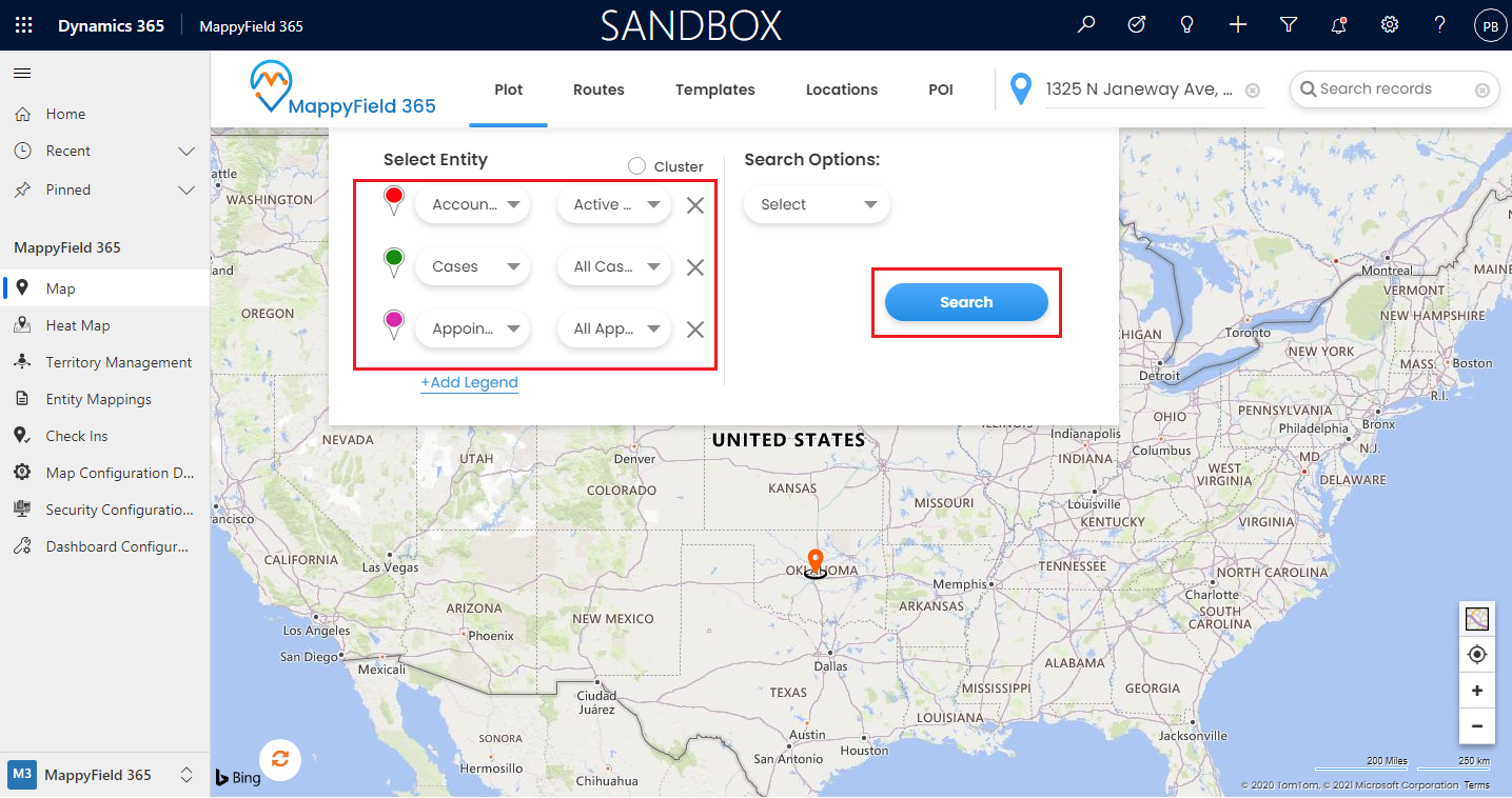
Here the records of three entities: Account, Leads, Appointment are plotted on the map.
Quick Details on Hover:
If you want to see the details of any plotted records, move the mouse cursor over the pushpins of that particular record and then you will get the label with basic details of that pushpin.
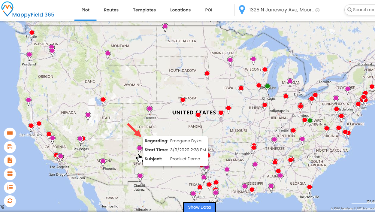
Note: The details you see as you hover over the pushpin can be configured from the Entity Mappings under the Entity to Map. You can set the configurations entity wise as well.
Enable/Disable Entity:
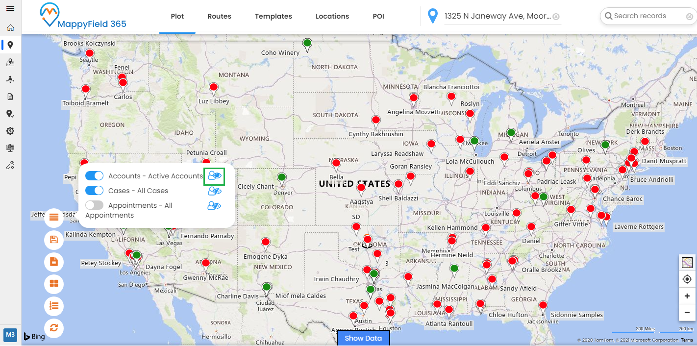
You can enable/disable any plotted entity on the map and you can also show/hide the label(title) of the records of a particular entity.
Here the records of three entities: Accounts, Leads, Appointment are plotted on the map but if you want to see only the records of the Accounts entity, you can disable the Case & Appointment entities by clicking on the switch(toggle) button.
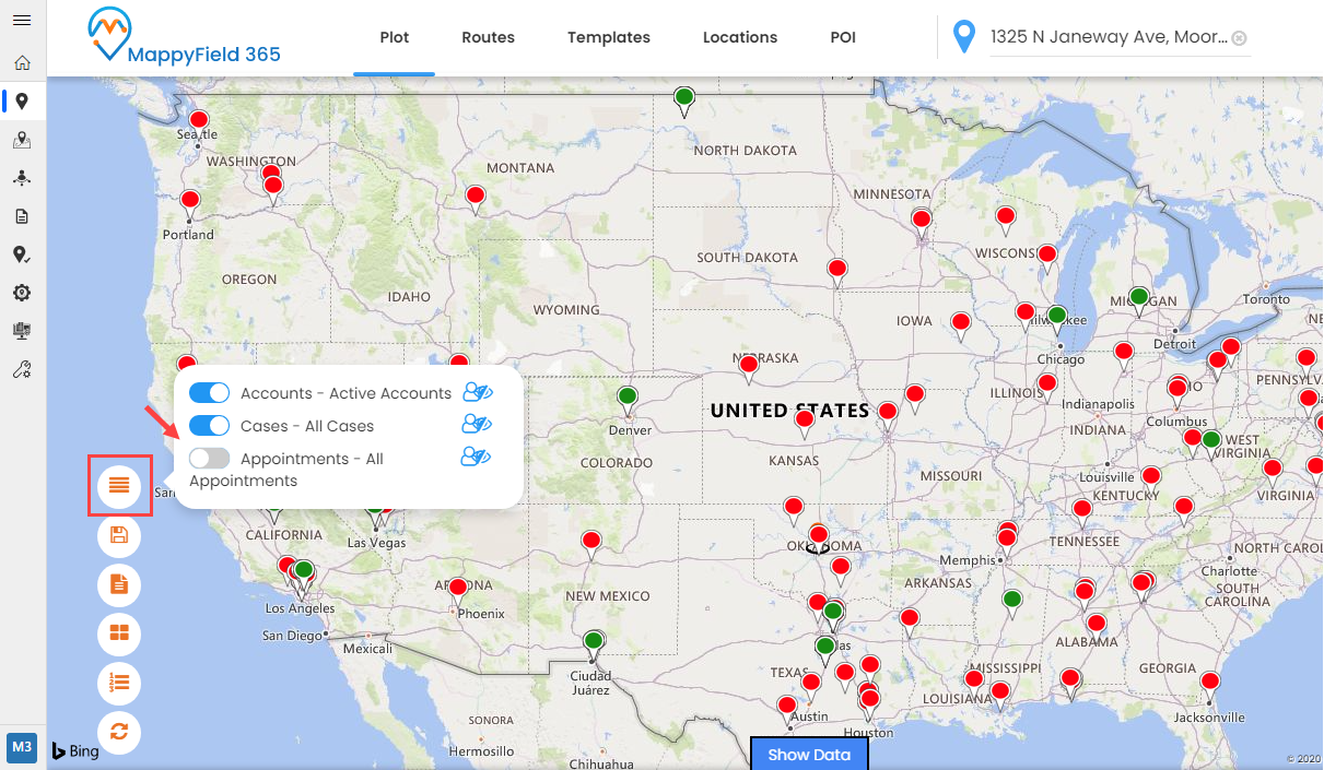
After disabling the Cases and Appointments, you will see the records of only Accounts entity.
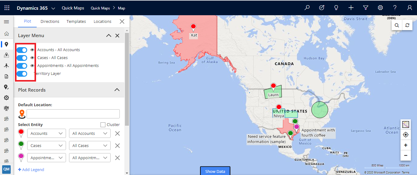
So, using this feature, you do not need to remove the entity every time and select the entity again. You can just disable the entity under the Layer Menu and enable it again as per your need.
Show/Hide Labels:
Now, if you want to see a label (title) for plotted data, you can click on the eye icon besides a particular entity to see the label of that particular data.
Step 3: Plot entity on map with search option as territory
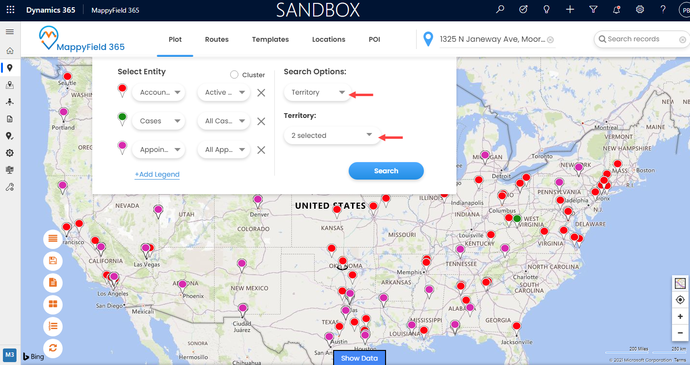
You can also view records on maps based on Territory. By selecting the ‘Territory’ in the search option, you will get the list of Territories in the dropdown menu.
After selecting the Territories which you want to plot, click on the Search button to view records of the selected territories.
Similarly, if you want to show/hide territories, click on the switch(toggle) button of the Territory layer. And to hide/show the labels of the entities on the territory, click on the eye icon of any entity.
This way you can take the advantage of your CRM data by visually representing it on a map which can speed up your analysis and help you deliver more in less time.


Comments
Post a Comment